


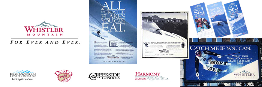
This case study is a few years old now, but in terms of an underdog using market strengths to equal a larger opponent, it's still worth a look. At the time of this re-branding, Whistler Mountain was independently owned. Intrawest was pouring big bucks into Blackcomb Mountain, giving skiers more lifts, better facilities and a hip new attitude. So what did Whistler have? Terrain. History. And a genuine feel that can only come from being the original.
Of course we all know that Intrawest scooped up Whistler Mountain a few years later. (For the terrain, naturally) It goes to show nothing is really forever. But I like to think we drove up the share price, at least.
©2006 Lorne Craig – Unicycle Creative – 604 831 2432 – lorne@unicyclecreative.com